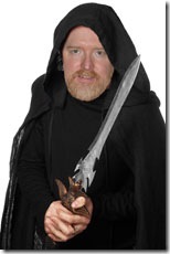
 When I first set up my blog site and my social media accounts, I needed to select an image to use for my profiles and for my avatar. My goal was to create a unique image that clearly represented me as a fantasy author.
I enlisted the help of my graphic-designer wife, and together we came up with the image I’ve been using for the past six months or so. We created the image by overlaying my face onto a stock photo I found of a fantasy warrior holding a sword. The man in the photo was wearing a black cloak and hood, which made it easy to swap in my face.
Unfortunately, when the image was cropped and reduced in size, the detail of the sword was lost entirely. To many people, it looked like I was dressed up as Obi-Wan Kenobi. The sword could easily be mistaken as a light saber at low resolutions.
Now, I’m a Star Wars fan, and having people think I had the Obi-Wan Kenobi look was okay, but let’s just say it wasn’t the reaction I was looking for.
Making Magic
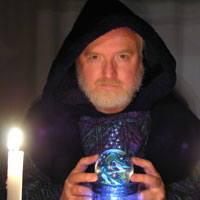
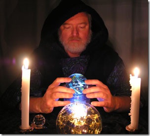 Rather than trying to put my face into a more complicated image of a warrior or mage, I decided that it was time to dress the part. I have a druid Halloween costume from many years ago that was just what I needed. The trick was to create a setting that would convey the fantasy element.
I came up with a vision for the setting that involved candles and a crystal ball. I searched the house for items that would help me create the look I was after, and I eventually came up with a section of black velvet, a small crystal sphere, and a few candles. I don’t have a crystal ball, but I do have a beautiful glass ball with a swirling pattern inside. To bottom-light the glass ball, I placed a small LED puck light in the bottom of a hand-blown glass vase and set the glass ball itself on an upside-down jar sitting on top of the light.
The next question was how the camera would deal with low-light shooting conditions. I tried a number of different settings, but in the end, using the automatic settings worked out best. I could have probably fussed with the manual settings and gotten better control over the depth-of-field, but the camera’s automatic controls gave acceptable results.
The only light in the room came from the candles and the LED light inside the vase, so we knew the exposure times would be rather long. We used a tripod and the self-timer to ensure a steady camera, but the rest was up to me holding still. Yes, we took a lot of fuzzy pictures.
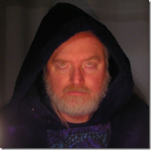 In total, we took about 50 photos. We’d take a dozen or so and then go check out the results on a full-sized screen. We’d then plan another dozen shots and do the same thing.
One of the strangest effects happened when I blinked or changed where I was looking while the shutter was open. We tried to get a shot where I was giving “Spoc eyebrow” to the camera, but we never did get that one quite right. Instead, we got several creepy shots with my open eyes superimposed over my eyelids.
After the first round, we figured out that I needed to pull my hands back around behind the crystal as much as possible. I have big hands to begin with, and putting them fully into the foreground of the shot was a bad idea. In the second round we concluded that we liked the images where I was looking at the camera better than the ones where I was looking at the glass ball. After the third round, we decided that I needed to lean forward over the glass ball to put my face closer to the light and in the same focus plane as the glass ball.
Photoshop Time
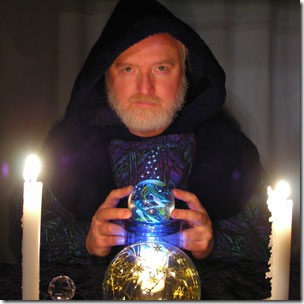 We finally got a few shots we thought we could work with.
From there, I sat down with Photoshop and started tweaking. There was a small sliver of wood inside the hood on the left that needed to go away, and the camera introduced a few tiny spots of digital noise here and there, but they were easy to correct.
While I was in Photoshop, I decided to “magic up” the image a bit and added the little bubbles that come up from the glass ball. I copied two prototype bubbles out of the glass ball itself, and duplicated them multiple times.
When I was happy with the image, I created a full-view version for use on the “about the author” page on my blog, and a zoomed-and-cropped version for social networking/avatar purposes.
With any luck, my new image finally conveys fantasy instead of science fiction!
***
How did you decide on which image to use for your web presence? Did you agonize over it or just take the first thing that looked good enough? Do you think I managed to get across the idea of “wizard” instead of “Jedi Knight” this time? Tell me in the comments!


I love the picture. Your work paid off. You definitely look "wizardly". Love and hugs, Mama Marvello
Thanks for coming by and commenting, Mom. I’m glad I achieved the desired effect. I had one person say I looked "sinister," which isn’t really what I was going after, but "wizardly" seems to be the consensus, and that makes me happy!
I love it Daniel! You definitely convey a "Wizard" theme here and I think it’s very well done. Bravo!
Thanks, Christy! Thank goodness for old Halloween costumes. 😉
I think it all looks quite fine. For me, it’s the writing that counts anyway. But this is a great attempt at branding.
Michael: You saw right to the heart of the matter. The prior image had the wrong branding, thus the do-over. As you say, the writing is what really matters; however, I want the branding to already be in place before I release the book.
Even looking at the tiny twitter picture on the right, the image that comes to mind immediately is ‘Wizard’, so I’d say you have it spot on 🙂
Thanks, Sarah! I’m glad you were able to discern "wizard" from such a small image. I think making sure a candle remained visible in the cropped version really made a difference.
Hi Daniel, I love the wizard. Your hard work paid off, but you have the look, you could rock the Obi-Wan look as well. 🙂
Hi Prudence! Thanks for visiting and for your kind comments. I just started "Novan Witch" and I’m enjoying it. It’s not normally the type of thing I read (heterosexual male that I am), but the story is good and the characters are interesting. What more could I ask?