My wife received a Kindle 2 as a gift a couple of years ago. She gave it a try for a while, but eventually went back to reading print books. When she let me borrow the device, I was instantly hooked on the experience. I still read print books occasionally, but e-books have become my preferred format.
When the time came to publish my first fiction novel a couple of years ago, my e-reading experience helped me make the decision to format my own e-books rather than outsource the task. I saw so many poorly-formatted books that I didn’t want to take the chance that my own books would look as bad. From conversations with other fiction authors, I knew to expect that e-books would represent the vast majority of my sales, so I wanted my readers to have the best digital reading experience I could give them.
Learning to format e-books was not a small task, but my technical background as a web application developer definitely helped ease the learning curve. I’m still learning, which is partly what this article is about, but overall, I’m proud of how my e-books turn out.
From Print to Digital
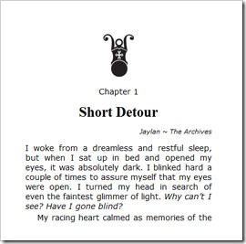 My wife has done print cover design and interior layout for over a decade, and we’ve published our own books in print since 2006, so I’m familiar with many of the standard typographic conventions for book layout. Some translate to digital nicely, while others have no analog.
My feeling is that it makes sense to follow the conventions that readers have learned to expect for generations, but at the same time, I would like to take advantage of the new capabilities of the digital medium.
Here are some of the print conventions I’ve brought forward into my digital books:
- Start each chapter on a new page.
- Include white space around the chapter heading at the start of each chapter.
- Use a glyph or some other indicator at scene breaks.
- Use full justification (some devices let readers select “ragged right” if they prefer that look.)
- Indent all paragraphs except the first paragraph of a chapter or scene.
I also like having a raised cap letter on the first word of a chapter. I did that for a while, but the rendering engine for the KF8 Kindle format does an even worse job of supporting that feature than its predecessor did. It generates exaggerated line spacing between the first and second lines of the paragraph. I’m letting that one go for now, but may revisit it some day or try alternatives.
Here are a few other minor improvements I’ve made:
- Give each chapter a title so the table of contents doesn’t read, Chapter 1, Chapter 2, and so on.
- Indicate the POV and location at the beginning of the chapter. (I’m still debating this one. Some beta readers liked it and some did not think it added anything.)
- Include a release number on the copyright page (digital editions only.) I have no plans to make substantive changes to my books, but if I do fix a typo or make other minor changes (like adding a thank you page), the release number tracks these updates.
Beyond Print
Some of the features unique to e-book readers give us the opportunity to go beyond print. Here are some examples:
- A linked table of contents: click on an entry in the TOC and navigate directly to that section of the book.
- A progress bar with chapter break indicators.
- A record of “furthest point read.”
- Guide links that make it easy to quickly go to specific pages of the book (start of content, table of contents, cover, and more).
- Automatic positioning of content: the book opens to the first page of content the first time you open it. From then on, it opens right where you left off.
- Shareable comments and highlighting.
We do lose a few things though. When I pick up a print book, a glance at the cover gets me back into the mood of the story before I even open to my bookmarked page. If I acquired the book some time ago, a quick read of the back cover reminds me of why I chose the book for my To-Be-Read pile.
I miss getting a glance at the cover. I wish the static image that the Kindle displays when it goes to sleep were the cover of the book I’m reading, rather than one of the random images it currently displays (each of which I’ve seen dozens of times). Alternatively, I would like an option that would display the cover image for a few seconds when I turn on the device. If I don’t want to wait those few seconds, hitting page forward would return me to the place where I left off as usual.
I can’t do much for readers about the front cover issue. That’s up to the device vendors. But I can do something about the back cover, “I forgot why I bought this,” problem. More on that below.
Filling in the Gaps
I hang out on a few online forums where authors and readers share their thoughts on the ways we can improve the digital reading experience. I’ve learned a lot from those discussions, and what I’ve learned has led me to make two significant changes to the way I design e-books. Vaetra Untrained was the first e-book to receive these enhancements, and I plan to retrofit them into the other e-books I’ve created at some point.
The first change I made is to add a synopsis page to the front matter. My second change was to add a thank you page to the back matter.
After adding these new pages, my e-book layout goes like this:
- Cover
- Title page
- Copyright page
- Dedication
- Table of contents
- Synopsis page
- Story chapters
- Thank You page
- Acknowledgments
- About the author
Some authors have experimented with putting the Table of Contents at the back of the book. I decided not to do that because it messes with the “furthest point read” marker. As far as I’ve been able to determine, the only down side to including the TOC in the front matter is that it may shorten the amount of content readers get in the excerpt on certain vendor sites. For novel-length books like mine, that difference is minimal. Besides, there’s an argument that well-titled chapters can actually turn a TOC into something that entices readers to buy.
Eventually, I may move the Dedication and Acknowledgements to the last positions. Most readers will stop at the end of the book or the Thank You page anyway, but those who want to know more about me or the book will continue on.
Synopsis Page
 The synopsis page goes immediately before the first page of story content. It includes the book title, any subtitle or series information (e.g. “Book Two of The Vaetra Chronicles”), and the synopsis (aka the description). When readers open the e-book, the first thing they see is the synopsis page.
The synopsis page reminds readers of why they downloaded the book and sets their expectations for what they are about to read. This can be important, because many readers will download a free or bargain book without even reading the description. Giving them a chance to realize what the book is about and discard it before they read it may save the author from a bad, “It wasn’t what I expected,” review.
Initially, I added the synopsis to the title page and started the book there. I’ve decided that was a bad idea, because readers have to step through the copyright, dedication, and table of contents to reach the first chapter.
Thank You Page
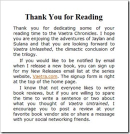 The thank you page follows the last page of story content. It expresses my appreciation to my readers for sharing their reading time with me. It also includes two important calls to action: it asks readers for a review and it asks readers to subscribe to my Release Notices list. The subscribe form for Release Notices is on the book web site, so it incidentally introduces readers to that site as well.
Some readers hate to write reviews or think they are expected to write the equivalent of a book report. I chose my wording carefully to avoid offending the readers who don’t like to leave reviews. I don’t expect readers to write a review, and I don’t want them to feel like I’m being pushy about it. I also make it clear that all I’m asking for is a sentence or two that tells other readers how they felt about the book, not a detailed analysis.
I believe the thank you page has already made a difference. Since Vaetra Untrained was released, I’ve gotten more subscribes to my Release Notices than ever before. Interestingly, I have not seen an improvement in my ratio of reviews to sales, although it’s too early to tell that for sure.
Open to Suggestions
I’m always on the lookout for ways to improve the quality and usability of my books. If you have suggestions, I’d love to hear them. I also welcome your opinions on my new synopsis page and thank you page. Do you think they add value to the book? Should I add anything else that would be useful to you? Tell me in the comments!



Really appreciated your step-by-step, many of which I already do. You opened my eyes with your Thank You page, Acknowledgements, and About the Author. Thank you.
Thanks for commenting, Janine. I’m glad you enjoyed the article. Best of luck with your books!
Hi Daniel,
Those are some great notes about improving the ebook experience. I think I might start working your Synopsis Page idea into my future volumes; it’s a great way to include a sort of "back cover" in the book, which is one of those few things that I definitely miss from the paperback experience.
Vaetra Untrained is high on my TBR list, and there will be a review when I’m done! =)
– Chris
Great explanation. I use a very similar approach – except I’ve subsequently gone back to putting the start position on the beginning of the story, rather than on the synopsis.
I think I’m going to go back to putting it on the synopsis. I was worried it would be irritating for readers, but I guess it’s just a paragraph, and one click will take you to the beginning of the story.
I look forward to formatting my own ebook in the future (after I finish my story, of course), so thanks for the tips.
BTW, what online forums are you refering to in your post? Thanks.
Hi Chris! Good to see you again. Thanks for the compliment on the article. I hope you enjoy "Vaetra Untrained." I look forward to your review.
Thanks for your feedback, Masha.
I agonized over where to start the book too, but ultimately figured there wasn’t any point in adding the synopsis page if readers never saw it.
My other rationale for starting on the synopsis is that readers only see it the first time they open the book, which is the only time that it really matters. Once they start reading, they return to wherever they left off, so the synopsis doesn’t get in the way.
Welcome back, Ken!
I hang out on a couple of writer’s forums. The most active one is Kboards.com. The other is WritersPub.proboards.com. I’ve also just started participating in the "Fantasy Writers" and "Fantasy Writing" communities on G+.
Most of the conversations about the business of publishing have happened on KBoards.com.